Industrial labels share a feeling. Pharmaceutical boxes, capacity plates, electrical warnings, shipping manifests. Dense, scannable, decorative in zero places, somehow calming. Most people respond to them even if they don't design things. The engine is an attempt to make that feeling on purpose.
Every measurement comes from one number, the x-height of the loaded font, pulled directly from OpenType metrics. The unit is 1U. The grid is 1U, the gutter is 0.5U, an icon base is 2U by 2U, a header sits at 1.2U, a data row is 1.2U tall. Nothing is set by eye. The proportions are inherited from the font, which is why the relationships feel inevitable rather than placed.
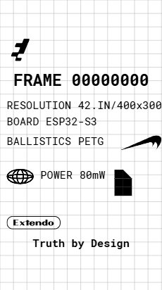
Three kinds of element move through the canvas. Spanners are the bold full-width headers that interrupt the flow and reset the cursor to the left. Blocks are small square-ish marks that carry icons or labels and pack side by side until they hit the canvas edge and wrap. Data streams are tabular label-and-value rows at consistent height. All inherit the same grid.
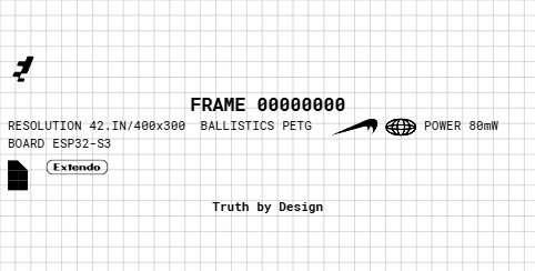
You don't position elements, you sequence them. The engine uses guillotine bin-packing, treating the canvas like a typewriter and letting each element find its row. The constraint is the point. Removing positional freedom collapses a thousand decisions into deciding what comes next.
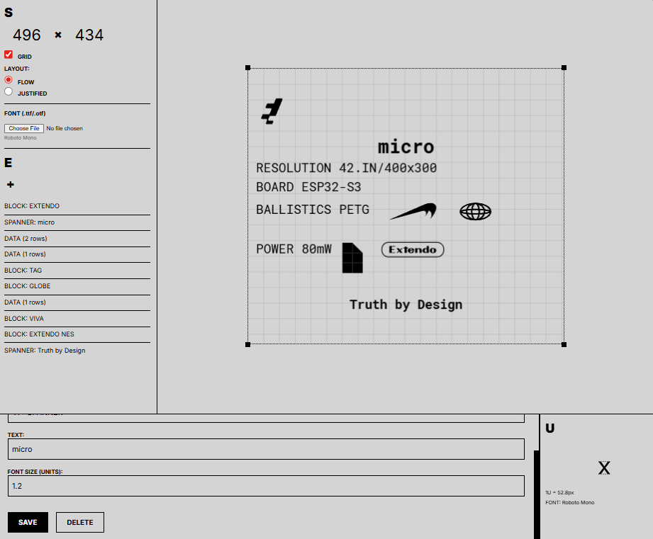
Built with Paper.js for rendering and OpenType.js for font metric extraction. The renderer runs in two passes, measuring the composition at the base unit and then re-rendering at whatever scale fits the canvas, so labels never overflow. SVG logos drop in with aspect ratio preserved. The diagnostic panel shows the unit system as a visible grid with the x-height drawn as a guideline overlay. The math made visible.